In our previous post, Your Identity: Vision, Mission, Values and the Ultimate Why, we built up our case for the power of a brand. To recap, business owners can build powerful brands like McDonald’s, Nike and FedEx. First, however, small-business owners and entrepreneurs must create a marketing strategy to achieve this.
Take a glance at the logos or even just the colors that Target, Apple or Google use, and you immediately understand who the company is, what they do, and maybe, what they stand for. The companies’ colors immediately identify them as powerful, trustworthy brands.
A good brand is just as important to small businesses as a Fortune 500 company. Small business owners can also create impactful marketing messages, logos and colors.
Building a powerful brand comes out of a thoughtful marketing strategy. Creating this roadmap backs the brand up and provides invaluable and influential assets for business owners and entrepreneurs.
A marketing strategy includes many things, such as the colors a company uses to reach the most potential customers effectively and efficiently. Choosing the correct colors to use for marketing a company can be as strategic as a company’s logo, tagline or target audience.
However, many business owners get stuck on what colors best represent the company. In addition, using multiple colors can muddle your marketing messages leading potential clients or customers to get confused about what the company does and what it stands for. As a result, they may lose trust in the company, or the business wastes time and money on marketing efforts that don’t pay off.
In this blog post, we will discuss why colors are necessary, and the common pitfalls most small businesses and entrepreneurs encounter with choosing and using colors.
Why are colors necessary for making a powerful brand?
When most people think of brands, they get a picture or color in their mind that represents the company. Think of Lego’s iconic yellow, Pepsi’s blue and red or the recognizable brown UPS uses. How did they choose their colors, and why did they think these colors would best influence people to their products and services?
There are situations where a company’s marketing team may have played pin-the-tail-on-the-color wheel, but more often, picking a company’s colors results from marketing strategy sessions.
Why spend so much time building a strategy before choosing colors? Can’t you plug and play a cool color? No. Why? Because a brand is an intangible asset that encompasses a consumer’s total experience with a company or product. A well-constructed brand builds trust with potential clients, and when existing customers find a brand valuable, they will return to it.
Customers get confused when a company makes a brand on a whim or starts messing with the colors or logo. And if you confuse, you lose.
Color confusion
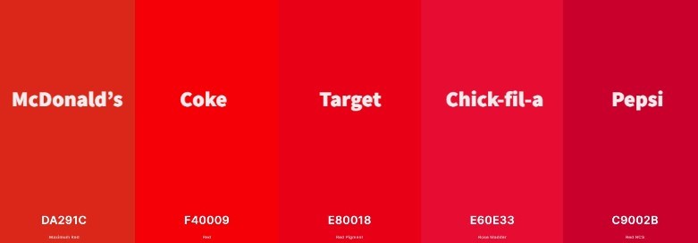
Colors can be confusing. Take the color red, for example. Below you can see the variety of reds companies use. The difference between Target’s and Chick-fil-a’s red is very subtle, but more than likely, people would notice the differences; certainly, internal execs would. In the world of big business, people can lose their jobs for using the wrong color in the wrong place. This shows the importance of always using the same color to enhance the power and quality of your brand.

Unfortunately, because busy entrepreneurs either don’t have time or know how to choose colors strategically, they often inadvertently weaken their brand by using various shades of their main color (i.e., blue, red, green, etc.).
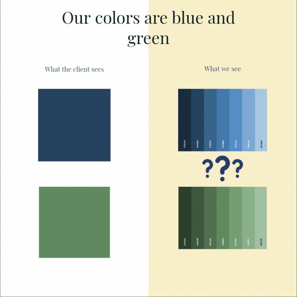
Almost anyone can fall prey to color confusion. For example, have you ever asked another business owner their company colors? Did they say blue and green? Here is an example of the difference in perceiving what the client sees and what Uptimize sees when a client tells us their company colors are blue and green:

Ever paint a room? If you have, you know there is an overwhelming amount of paint colors to choose. Sherwin Williams has over 30 color filters on their website to narrow down just the right shade to fill anyone’s inspiration. How about the cosmetic aisle? If you are looking for the most popular mascara, it’s Loreal’s Voluminous Original. But this mascara comes in Black, Blackest Black, Black Brown and Carbon Black.
Using multiple colors
Most business owners don’t specialize in color; therefore, companies will often change the colors they use depending on the application. For example, a graphic designer will use color codes to ensure the color used in advertising and marketing is the same no matter what media the company uses.
In some cases, business owners don’t have time to pull together the color codes the company already has. More often, business owners either don’t know the color codes or get too busy and try to match the colors to meet a deadline. Using multiple colors makes the advertising appear different, which weakens the brand’s power.
Using colors that don’t reflect the brand
A company may need new or updated colors when:
- An established company undergoes a significant change, such as a new owner or the launch of a different product or service. These changes require a reevaluation of the colors the company uses. In these instances, companies may have multiple colors, logos, taglines or even multiple company names and phone numbers it’s using.
For example, Mailchimp rebranded to reflect its change from providing email marketing services to a complete marketing platform. They also needed to change their style and tone. Mailchimp changed many things to reflect their growing services and values, but you can see this most dramatically with their shift from white to yellow.

- A company has been in business for a significant period and uses outdated colors. Marketing professionals can dive into the company’s history, take stock of previous marketing and create new colors and marketing materials that match the new or updated company’s look and feel.
You can see a significant change in color tone for American Airlines after its rebrand, the first in over 40 years.

- Changes in the market require a new marketing direction. If the industry or competitors are upgrading and changing to fit new consumer tastes and habits, new colors may help refresh the brand’s presence.
For example, Dunkin’ Donuts, now just Dunkin’, changed its marketing focus to compete with Starbucks’ coffee offerings. However, instead of messing with the colors and losing total brand recognition in the marketplace, Dunkin’ stuck with changing many things like its logo and packaging but didn’t touch the color scheme.
Final thoughts
Unless you are a marketing professional, colors, color codes and consistently using colors shouldn’t be top of mind.; Small business owners have other fish to fry.
Establishing company colors are essential to marketing and is one step to building a powerful brand. At Uptimize we understand how difficult it can be to navigate the marketing jungle. That’s why we’re happy to help. Feel free to ask us anything you want by booking a free consult with us.
At Uptimize, we believe in helping businesses succeed. We do more than provide excellent marketing services; we partner with our clients and help them take their business to the next level. Up your game with Uptimize.


 for it? Let us Uptimize your business!


